
Laying a foundation for the new B.C. Design System
|
Online Service Solutions (OSS) is the cross-functional team at Government Digital Experience (GDX) that maintains gov.bc.ca, intranet.gov.bc.ca and the CMS Lite content management system, including their infrastructure and related products like search and virtual assistants.
For the past year, the OSS team has been building the strategy and infrastructure to support a new design system for the B.C. Public Service. The short version:
- We’ve just shipped a major release (v3.0.0) of our design tokens package
- The design system has a new home at gov.bc.ca/designsystem
- We’re now working on building out a component library, and have published a developer preview
A legacy to build from
The B.C. government’s legacy design system dates back to early 2019, but has been functionally in stasis since mid-2020.
The plan was for this legacy design system to be supported by a community contribution model. But without active stewardship, the product never escaped its infancy. UI/UX design and software development practices in the B.C. Public Service have evolved, and the legacy system has not kept pace.
Designers and developers tell us that the legacy design system has been and remains a valuable resource — but it could be so much more.
Finding our goals
In early 2023 as part of the rollout of gov.bc.ca’s new look and feel, GDX began exploring what a refresh or replacement of the design system could look like.
Through conversations with dozens of designers and developers from across government, we found significant demand for a central design system to:
- Improve cross-functional collaboration by serving as a common point of reference for designers and developers
- Enable teams to design and build more quickly and easily
- Encourage consistency in UI design and behaviour across B.C. Government digital products
Here’s a summary of our research findings (IDIR required).
Based on these conversations and a detailed retrospective look at how the legacy design system was designed, built and maintained, we’re now working on a ground-up rebuild. Our team is building on lessons from the legacy system and carrying on its ethos, while retooling the technical architecture and delivery to better fit 2024’s operational needs and the missions set out in the Digital Plan.
Our approach
Over the past 6 months we’ve been quietly shipping the basic building blocks for the new design system, testing and iterating on them with early adopters in CITZ and other ministries.
The new B.C. Design System comprises 3 parts:
- A documentation and wayfinding hub on gov.bc.ca
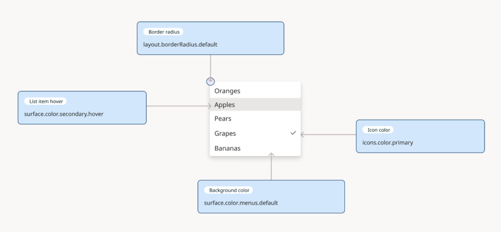
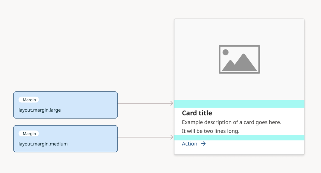
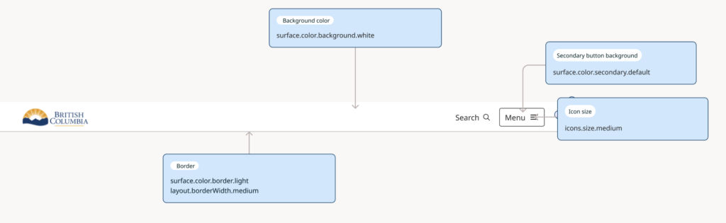
- A design tokens package that encodes the most granular elements of the design system’s visual language into Figma, JavaScript and CSS variables
- A library of reusable user interface components, published simultaneously in a Figma library and in code
The visual language for the design system is rooted in gov.bc.ca’s new UI and everything our team learned from the extensive public engagement, user testing and iteration that involved.
What’s available now
In January 2024, we started publishing experimental builds of our design tokens package on Figma and npm. We’ve been testing those libraries with designers and developers, and have just shipped a major update (v3.0.0) to the package:
We’ve also launched a new digital home for the design system at gov.bc.ca/designsystem. This will serve as the documentation and navigation hub for design system assets and resources.
What’s coming next
The most important and most complex work comes now: building and shipping the library of reusable UI components that represent the heart of the design system. As a starting point, we’ve identified around 20 individual components that we consider a Minimum Viable Product.
We are using the extensive design work that went into gov.bc.ca, our design tokens and Adobe’s React Aria package to accelerate this work, but it remains a very heavy lift for a small team. We plan to ship components one-by-one as they meet our definition of done.
We have already started publishing developer previews of the React library on npm, and will start publishing a Figma library and individual component documentation soon. You can review our public roadmap to learn more about what we’re working on.

Operating principles
In setting our path, we’re guided by a set of basic principles that help us understand what we’re building and how:
Treat this as a product, not a project
Design systems are digital infrastructure that must evolve over time. Decisions we make now have to be sustainable and scalable over the long term.
Make a clean start
Learn from all the work that went into the first iteration of the design system, but do not import tech debt.
Meet users where they are
Provide functional design assets and code that can be used off-the-shelf, not just as reference materials.
Designer experience and developer experience are of equal importance
Solve for the design system’s two distinct audiences, who work in very different ways and with very different tools.
Rigorously maintain internal consistency across resources
Closely align designer- and developer-facing assets so the design system can succeed as a common point of reference.
Technical decisions
For the design system’s tooling, we have to strike a balance between:
- The need to provide functional assets that fit into teams’ tooling and tech stacks
- Committing only to what we can practically maintain with a small and frequently multi-tasked team
For designer-facing resources, our choice was straightforward. Figma has become an industry standard for digital design, and adoption is accelerating across the public service.
For developer-facing assets, our decision process is complicated by fragmentation in the front-end development ecosystem. We are committing to React, which we believe is the most popular framework in the public service.
Based on a manual sample of 281 repos in the bcgov organisation on GitHub, we estimate that around 40% of projects use React, compared to approximately 15% each for Vue and Angular. If you have better data on front-end framework adoption in government, we would love to hear from you!
We are not officially supporting other frameworks at this stage, but we’re open to working with teams who may want to reimplement design system components.
You can get involved
We want to know what you think of what we’re building, and what you need from the design system. Our goal is to make your lives as designers and developers a little easier, and we need your insight to help us prioritise what to work on.
The design system is open source, and we welcome contributions from the design and development communities. We are looking forward to working with teams who want to contribute to, fork or extend the design system — but we also have a lot of work ahead to figure out the contribution and governance models to support that.
You can send feedback, comments, bug reports or feature requests to designsystem@gov.bc.ca or open an issue on GitHub. You can also find our team in the Design Systems group on Teams or the #ux-guild channel on RocketChat.