
Content style guide
Our style guide supports teams developing content for things like websites, apps, online forms and of course digital.gov.bc.ca. It complements the gov.bc.ca Web Style Guide, with practical advice specific to digital products. It offers standards and best practices to ensure consistency and clarity across all B.C. government platforms and products.
If you have a formatting, editing or writing question that we don’t specifically mention, please refer to the Web Style Guide.
Last updated on
How we write
Think about the end product you’re creating content for. Chances are it’s not a word document or PDF. Many of us learned to write in school, with formatting and sentence structures based on an essay or report.
Content for a web page, mobile app or digital form needs to be different.
The best digital content is invisible. It just makes sense and it gives you the information, context or instructions you require.
It’s also important to ensure all digital content meets the Web Content Accessibility Guidelines (WCAG) 2.2 Level AA standards to provide an inclusive experience for everyone.
Tone and voice
We take an authoritative and straight-forward approach. A friendly, yet firm voice. digital.gov.bc.ca is a website all about standards and guidance, we want our readers to feel confident and follow our lead.
We address the reader as “you.” This helps establish a conversational tone.
The use of plain language
You may have heard the term plain language before. But what does it actually mean?
- The use of simple words
- Short sentences with straightforward formatting
- Transparent, accurate and unbiased information
- Action-oriented. Empowering the reader to take action and make informed choices
Plain language training is available for B.C. government employees.
Reading level
Plain language helps you achieve an accessible reading level. We aim to keep our reading level at a grade 8 level or lower. This is not always possible when writing about complex development or digital modernization terminology.
Words and phrases to avoid
To avoid
- Public servant
- User
- British Columbians, citizens
A better alternative
- Public service employee
- Reader, person
- People who live in B.C.
The use of bulleted lists and white space
You may have noticed our website favours bulleted lists and ample white space. This is deliberate.
When a block of text is broken up, it’s easier to scan and therefore easier to read. Bullets make this possible because they:
- Break up text in digestible chunks
- Make the overall content less dense
- Highlight the most important parts of your content without the need for other design elements
- Help readers quickly find the information they need
Using bullets in your content is also a writing hack. When deciding how you want to structure information it’s always good to ask, “Could this be a bulleted list?”
Headings and structuring your information
Headings tell a story. A reader should be able to summarize your content’s focus solely based on the headings and sub-headings.
How to write strong headings
There are multiple things to consider when writing a heading.
1. Front-load headings
Front-loading means putting the most important word or words at the beginning of the heading. This makes headings easier and faster to understand.
Weak headings
- Everything you need to know about applying for funding
- When will my delivery package arrive?
Strong headings
- Apply for funding
- Delivery schedule
2. Do not write headings as questions
There are a couple reasons why we do not want to write headings as questions. First, the structure often does not allow us to front-load the heading. Second, a question can introduce doubt to the reader and skew search engine optimization (SEO) results.
We know that many people use search engines like Google by typing a question in the search bar. Google rewards web pages that answer these questions. As a government body, we want to have clear and authoritative answers and content.
Examples
Original: Is there evidence that the sky is blue?
- We know that the sky is blue. Let’s just say it
Updated: The sky is blue
- Clear statement of fact that’s also front-loaded
Original: Should I be worried about data privacy and security?
- If a reader of your content was not worried about data privacy and security before visiting your website, they may be now
- We’ve introduced doubt and highlighted that other people are asking this question
Updated: Data privacy and security
- This statement of fact is clear, concise and delivered with an authoritative voice
- People who asked the original question get an answer
3. Use a hierarchical structure
You must use a standard hierarchical heading structure:
H1: Page title
H2: Main headings
H3: Sub-headings to H2s
H4: Sub-headings to H3s
H5: Sub-headings to H4s, use sparingly
H6: Sub-headings to H5s, use sparingly
In addition to being an industry standard, this structure:
- Organizes information for the reader
- Improves SEO
- Is critical for accessibility, especially for people using screen readers
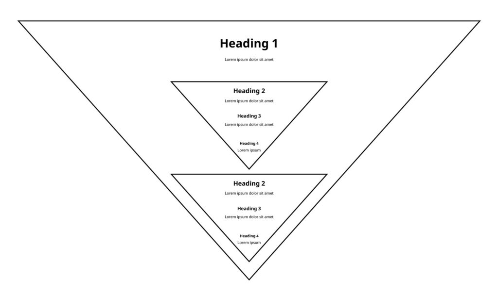
Inverted pyramid structure
The inverted pyramid is a writing structure commonly used in journalism, where the most important information is placed at the top of the article, followed by supporting details in descending order of importance. It’s like front-loading a heading, the most important ideas come first.
Journalists use this structure to make sure their articles are clear, concise and easy to understand, perfect for readers who have limited time or attention spans.
For print publications, this structure also allows editors to easily cut articles from the bottom up to fit the available space in the newspaper or magazine.
We take the same approach when writing our content.
Use headings to build your pyramids
When making a plan on how you want to structure your content, visualize multiple inverted pyramids, stacked vertically.
Formatting and punctuation
Formatting and punctuation may seem like a small part of content creation, but both make a big difference in the readability, polish and standardization of your product.
Sentence case
Use sentence case for all titles, buttons and calls to action. This includes the header, footer and all navigation.
This means you capitalize only the first letter of a sentence and the proper nouns.
Sentence case is considered the most readable form of text. It also spotlights proper nouns well.
Instead of:
- How To Write For The Web
Use:
- How to write for the web
Abbreviations and acronyms
General abbreviations and acronyms
Spell out words instead of using general abbreviations and acronyms.
Instead of:
- e.g.
Use:
- For example
Instead of:
- ETA
Use:
- Estimated time of arrival
Provincial abbreviations
British Columbia and B.C.
You do not need to spell out British Columbia before using the abbreviation B.C.
Always include periods between the “B” and “C.”
Using “BC” without periods is only permitted when referencing a brand or company. For example:
- StrongerBC
- CleanBC
- BC Ferries
BC Gov
This is abbreviated shorthand and should not be used in any public-facing content.
Digital-specific abbreviations and acronyms
Do not assume readers immediately understand an abbreviation or acronym.
The first time you mention a term on a page, write it out in full and include its abbreviation or acronym in parentheses. You can then use the short form for all further references on the same page.
- Artificial intelligence (AI)
- Minimum Viable Product (MVP)
- Content Management System (CMS)
- Structured Query Language (SQL)
- Software as a Service (SaaS)
- Platform as a Service (PaaS)
- Infrastructure as a Service (IaaS)
- User experience (UX)
- User interface (UI)
- Application Programming Interface (API)
- HyperText Markup Language (HTML)
- Cascading Style Sheets (CSS)
- Software-defined networking (SDN)
- Disaster recovery (DR)
Capitalization
Government
Capitalization in government-related terms is key to distinguishing between general references and specific entities.
When terms like “government” or “province” are used in a general sense, they remain lowercase. This style is often used on digital.gov.bc.ca. For example:
- Our goal is to create consistent content across all B.C. government platforms
When terms like “Government” and “Province” refer to the current elected government or are used as a proper noun, the first letters are capitalized. This approach is commonly used in news releases and official documentation. For example:
- Yesterday, the Province announced a new funding program for seniors
- The official website for the Government of B.C. is gov.bc.ca
Digital job titles
Job titles don’t need to be capitalized when describing general roles on a team. For example:
- They’re seeking an experienced web developer to join their team
- Our administrative assistant will contact you shortly
- Policy analysts often plays a crucial role in shaping effective digital strategies
Review detailed guidance on job titles and capitalization.
Agile and Scrum
It’s important to pay attention to the nuances of language.
As we navigate through a time where terms like “Agile” and “Scrum” are common and everywhere, we must take extra care to differentiate them.
When referring to the terms “Agile” and “Scrum” as a methodology and framework, the first letters should be capitalized.
This is to distinguish between:
- Agile (the practice)
- agile (the act of leaning in to change)
- Scrum (the framework)
- scrum (the gathering of people)
Examples:
- The company’s Agile approach emphasizes customer feedback
- “Agile” is used in this sentence to refer to the specific set of practices and principles used in Agile methodology
- Their team is known for being agile in managing complex projects
- In this context, “agile” describes the team’s ability to quickly and effectively adapt to new circumstances
Review our glossary of digital terms.
Compound words
Compound words are when 2 or more words combine to function as a single word. They’re used to convey information in a more compact way. Use them as single words, without hyphens, in your writing.
Instead of:
- Cyber security
Use:
- Cybersecurity
Instead of:
Use:
Symbols
Ampersands (&)
Spell out the word “and” instead of using an ampersand, unless it’s for a business name or a citation:
- AT&T
- Smith & Jones, 2001
Numbers
Use numerical symbol for numbers “2” and above, unless the sentence begins with a number.
Always spell out the numbers “zero” and “one” as words.
- The process took 7 business days
- Seven people attended the meeting
- We reduced our error rate to nearly zero
At symbols (@)
Only use the “@” symbol in email addresses and social media handles. For example:
- Email DO.ContentDesign@gov.bc.ca for more information
Colons (:)
Always use colons to introduce lists. For example:
Assistive technology includes:
- Keyboard navigation
- Screen readers
- Voice recognition
Commas (,)
Oxford commas
Avoid the Oxford comma for simpler, more accessible content.
Instead of:
- Build products that are iterative, adaptive, and responsive
Use:
- Build products that are iterative, adaptive and responsive
Multiple commas
Avoid multiple commas (,) in a sentence. You can do this by breaking it up into shorter sentences or changing it into a bulleted list.
Instead of:
- The software update will be rolled out next week, and it includes security patches, performance improvements and design changes
Use:
- The software update will be rolled out next week. It includes:
- Security patches
- Performance improvements
- Design changes
Em dashes (—)
Writer shorter sentences instead of using em dashes.
Instead of:
- The marketing strategy — specifically tailored for digital platforms — aims to increase our online presence by engaging more effectively with our target audience
Use:
- The marketing strategy for digital platforms aims to grow our online presence
Exclamation marks (!)
Use exclamation marks sparingly, as they can create a sense of alarm.
Use one per page at most, and only when appropriate to convey excitement.
Do not use exclamation marks to emphasize a point. The tone of your content should be calm and direct.
Instead of:
- Submit your application as soon as possible!
Use:
- Submit your application as soon as possible.
Percent symbols (%)
Spell out the word “percent” in sentences. Use the % symbol in financial charts, tables, equations and calculations:
- The team grew by 20 percent
Emphasizing text
The gov.bc.ca Web Style Guide has clear guidance on emphasizing text. Bold and italics are where most mistakes are made. Remember:
- Use bold sparingly
- Do not use italics unless it’s a scientific name
Content and design elements
Writing is designing, so be deliberate with your choices.
For best practices in visual design, layouts, colours and typography, refer to the B.C. Design System.
Calls to action
A call to action (CTA) is part of a reader’s journey through content.
A CTA can be used as bridge from one website to another. For example, reading background information on how to submit a funding application and then launching the application portal.
A CTA can also be used as navigation, linking readers from one section of a website to another.
Weak CTAs
- Learn more
- Click here
- Visit the website
Strong CTAs
- Apply now
- Explore the Digital Plan
- Complete your application
Use of buttons
Use buttons sparingly. On a single webpage, aim to only include 1 button. They draw the eye and make a great CTA. Too many and the reader can get confused.
Hyperlinks
Hyperlinked text needs to make sense without reading the content before or after it.
Links should be used to avoid duplicating content that is already published by other sources. For example, instead of copying and pasting instructions on how to apply for a bus pass, link to the official source.
Always link telephone or SMS numbers. Readers on mobile devices will appreciate the effort.
Always link email addresses.
Do not write out a URL and then hyperlink it.
Make sure the hyperlinked text matches the destination. For example, if the reader is being directed to a survey, the hyperlinked text should include key words like “complete the survey.”
Weak hyperlinks
- Click here for digital guidance information
- Learn more about our current survey
- For more information go to the gaming website
- Go to destinationbc.ca
Strong hyperlinks
- To improve your services, use our digital guidance
- Share your feedback, complete the survey
- GamesBC is the best source of information
- Visit Destination BC
Alerts
Alerts are best used to communicate urgent or time sensitive changes.
An alert must come with an end date. If your content has found itself with a long-term alert, it’s time to complete a content refresh.
Images and icons
All images must include corresponding alt text.
All images must have an appropriate license or permissions for use.
To align with government standards for the use of graphics in web content, we only use images that are relevant and add context to the text.
By following these standards, digital.gov.bc.ca aims for accessibility and maintaining a consistent experience throughout the platform.
PDFs
We strongly encourage the adaptation of PDFs into web content for accessibility and ease of maintenance.
Building a web page
When we’re creating new content or editing existing information for a digital.gov.bc.ca web page, these are the page elements we include.
Navigation title and page title
First, create your page title. It should clearly capture what your content is about.
Then, decide on your navigation title. This is often the text displayed in the breadcrumb navigation. It should be similar to your page title, but shorter and simpler.
Introduction sentence
An introduction sentence or sentences set the stage for the reader. It should provide a high-level summary of the content.
In our design research, one insight we found was readers wanted to know, “Is this information right for me?” To address this, we include a phrase like “Use this guide if you need to create an online form or survey.”
On-page navigation
A table of contents is a good way to describe on-page navigation.
For digital.gov.bc.ca, all our H2 headings are included in our on-page navigation.
For web pages that include content from a lengthy report or policy, we sometimes include H3s as well.
Date last updated
We include the date the page was last updated on all digital.gov.bc.ca pages. This helps the reader know if the information is current and can be trusted.
It also holds our team accountable to keep pages updated.
We do not change the date if we make a small edit, like correcting a spelling mistake or fixing a broken link.
Human-readable URL
URLs should be short and timeless.
A URL does not need to include the page’s full title. A URL should try to avoid the use of dates, like a year (2023).
A URL should also avoid using the same word twice. In this case, we do not need to mention British Columbia or B.C., as it’s always covered by digital.gov.bc.ca.
Weak URLs
- Digital.gov.bc.ca/policies-and-standards/bcs-digital-plan
- Digital.gov.bc.ca/guidance/digital-delivery-guidance/forms-and-surveys-2023
Strong URLs
- Digital.gov.bc.ca/policies-standards/digital-plan
- Digital.gov.bc.ca/guidance/forms-and-surveys